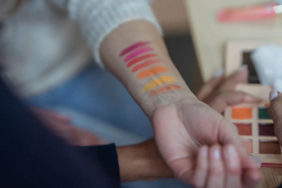
You stand in the aisle holding three bottles that all look vaguely beige. One leans peachy, one looks slightly grey, one is almost pink, and under the store lights none of them seems obviously wrong. You pick the middle one, take it home, and your face ends up looking like it belongs to somebody else. The culprit is almost never how light or dark the foundation is. It's the undertone, and it's the one thing most beginners are never told to look for.
Depth is how light or dark your skin is. Undertone is the colour sitting underneath that — the warm, cool, or neutral cast that stays fairly consistent whether you're pale in February or golden in August. Think of it as two dials: the first sets lightness, the second sets temperature.
This matters because two people can share the exact same depth and still need completely different bottles. A fair-skinned woman with cool undertones and a fair-skinned woman with warm undertones may both sit at "second lightest" in a range, but one needs a pink-leaning shade and the other needs gold. Buy by depth alone and you'll get a foundation that's the right darkness and the wrong colour — which is why so many mismatches look slightly off rather than obviously wrong.
Surface colour changes. Undertone doesn't. A tan adds depth and can shift how your skin reads, but it won't turn a cool undertone warm. Fair skin can absolutely be warm, and deep skin can absolutely be cool, so ignore the old shortcut that pink equals cool and yellow equals warm.
Golden, yellow, peachy, or honeyed. Foundations aimed at this group often carry names like golden, honey, warm beige, or a "W" in the shade code. Warm skin tends to look bright and healthy in cream or ivory whites, and gold jewellery usually flatters more than silver.
Pink, rosy, red, or slightly bluish. You'll see words like rose, cool, porcelain, or a "C" in the shade name. Silver and platinum tend to look better than yellow gold, and stark white clothing reads as a clean contrast rather than washing you out.
A balance of the two, sometimes described as beige or balanced. Neither gold nor silver obviously wins, and both warm and cool shades can look almost right — which is its own kind of frustrating, because "almost" is harder to spot than "clearly wrong."
Olive is a greenish or grey-green undertone that crosses the warm-cool line. If foundations consistently pull too pink, too orange, or too grey on you, olive is worth investigating. It's often the undertone that standard warm and cool categories fail hardest.
None of these is a laboratory result, and lighting can throw any of them off. Do them together in daylight and look for a pattern rather than one definitive answer.
Letters and numbers in shade codes aren't standardised across brands. Some use W for warm and C for cool; others label a shade by what it does for your skin rather than how it looks in the bottle, which is why a shade marked "cool" can occasionally suit someone warm. Drugstore names like ivory, sand, or beige are even looser — they describe a general impression, not a precise undertone.
Three mistakes cause most bad matches. Testing on your hand instead of your jawline. Judging colour under artificial light. And matching the foundation to your cheeks, where redness can push you towards a pink shade that then looks wrong against your neck. Match to the neck and chest, then even out any cheek redness with concealer or a colour-correcting primer instead of fighting it with your foundation.
If every shade pulls too pink or too orange, you have options. Mixing two bottles — one slightly too warm, one slightly too cool — often lands closer than any single shade, and colour mixers let you nudge a foundation a few degrees in either direction. Sheer formulas such as skin tints and tinted moisturisers are also far more forgiving of a small undertone mismatch, which makes them a good low-risk place to start if you're still figuring yours out.
One thing foundation can't fix is depth. If the bottle is two shades off in lightness, no amount of mixing will save it. And if redness, flaking, or persistent breakouts are behind your search for full coverage, that's a skin question rather than a makeup one — a dermatologist is the right person to ask, not the person at the counter.
Work out your probable undertone with the tests above, then go shopping in daylight if you can, with a bare face. Swatch three shades at the same depth along your jaw, let them settle, and check them outside. Buy the one you can't see, and don't be surprised if it sits in a category you didn't expect — many people assume they're cool because their cheeks flush, and discover they're neutral all along.
Get the undertone right and everything else gets easier. Concealer, bronzer, and blush all start behaving themselves, because they're finally sitting on a base that matches your skin instead of arguing with it.
Photo: George Milton / Pexels

A step-by-step holiday party makeup checklist covering skin prep, base and eye techniques, setting layers, and the...
Eye creams aren't essential for everyone, but they can earn their spot. Here's how to tell whether your face...
A practical seasonal guide to moving your body care from lightweight summer formulas to richer autumn hydration,...


British charm meets modern beauty..
